Quick Start
This article describes how to quickly develop a hello world self-built widget. This article describes how to quickly develop a hello world self-built widget.Please read the Application Brief Introduction in advance, prepare Development Environment , and learn about the Developer Tools you are about to use.
Developing a Hello World widget requires the following steps:
- Create Widget
- Install Widget Development Tool
- Initialize widget
- Launch Widget
- Preview Widget
- Publish widget
- Install The Self-built Widget
Step 1: Create Widget
Steps to create widget:
Open the AITable first, open any datasheet, and click the widget button in the top right.
Open the widget center: click "+" in the upper left corner to add a widget, open the widget center and see the "Create widget".
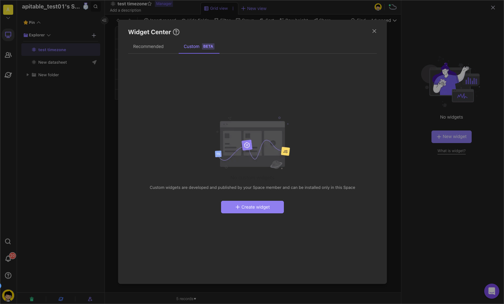
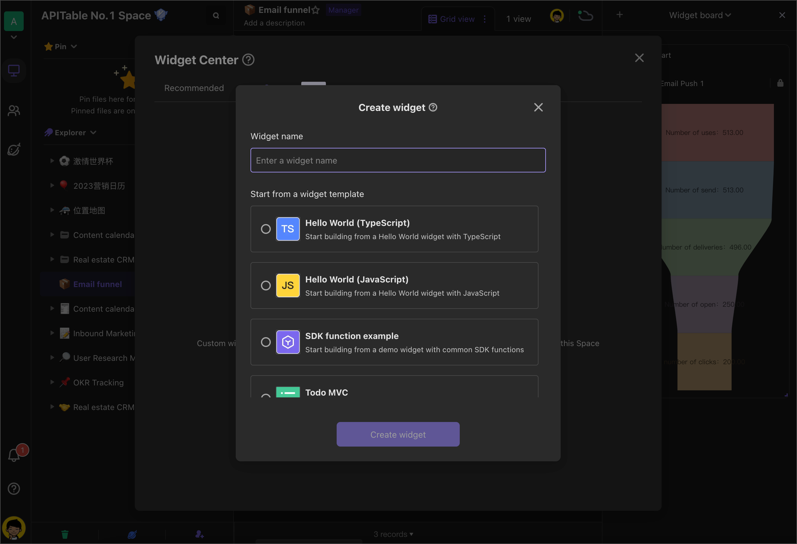
Edit self-built widget information:
Enter name
Select to start development from a component template
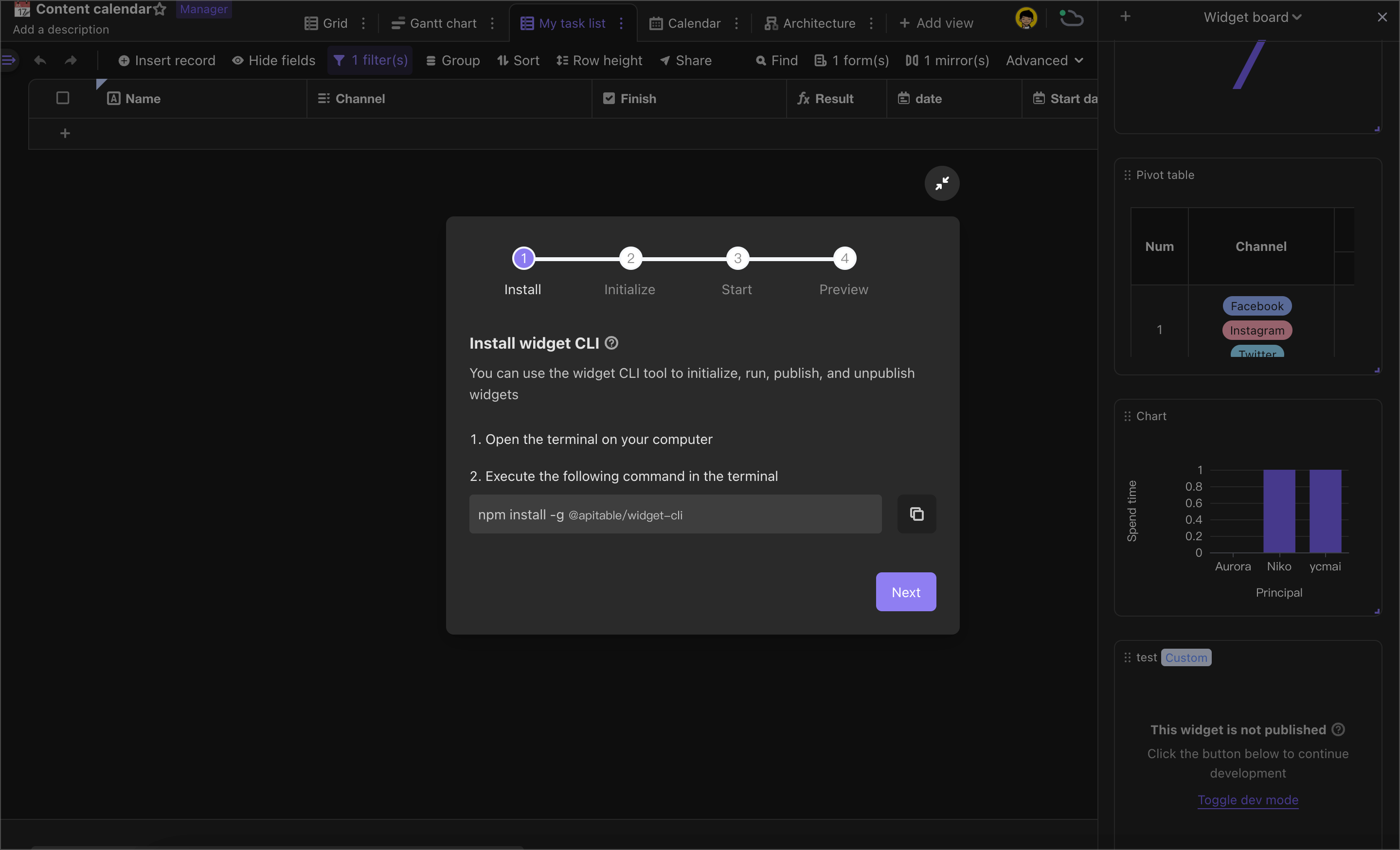
Step 2: Install Widget Development Tool
Execute the following command in the terminal:
npm install -g @apitable/widget-cli
Step3: Initialize Widget
This step is to authenticate you as a developer and create the project file for the new component.
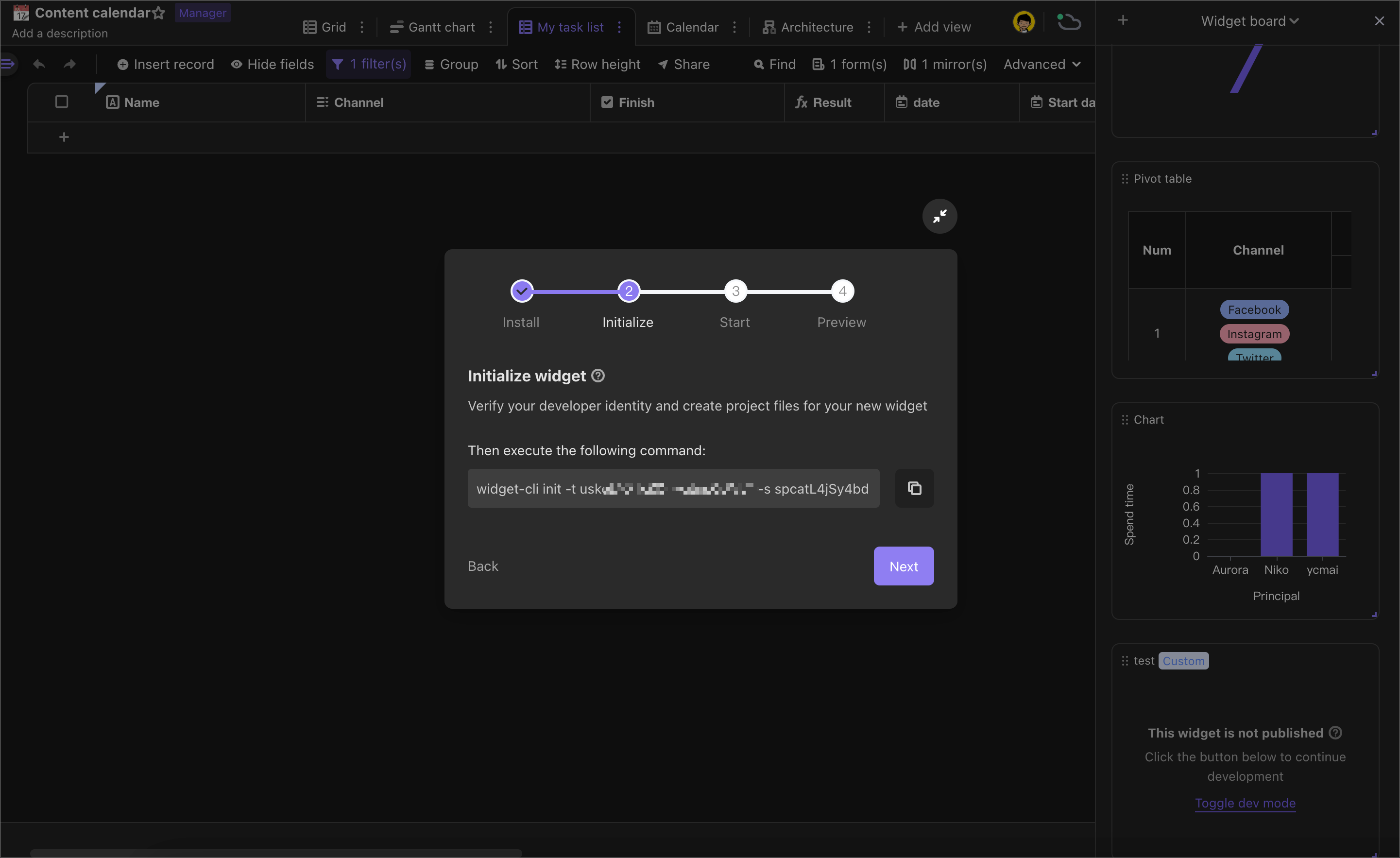
If you did not previously generate an API Token, enter the API Token after executing init command.
Get API Token as follows:
Sign in to AITable and tap the profile of the lower left corner, enter the User Center and go to the Developer Configuration.
Click "+" to generate an API Token.Note that an email address is required when is generated for the first time.
Copy API Token.
Note:
- Please secure your API Token, if API Token leaks, others may tamper with data in your datasheet.
- If the API Token is leaked, you can regenerate the Token in the Developer Configuration screen to ensure data security.
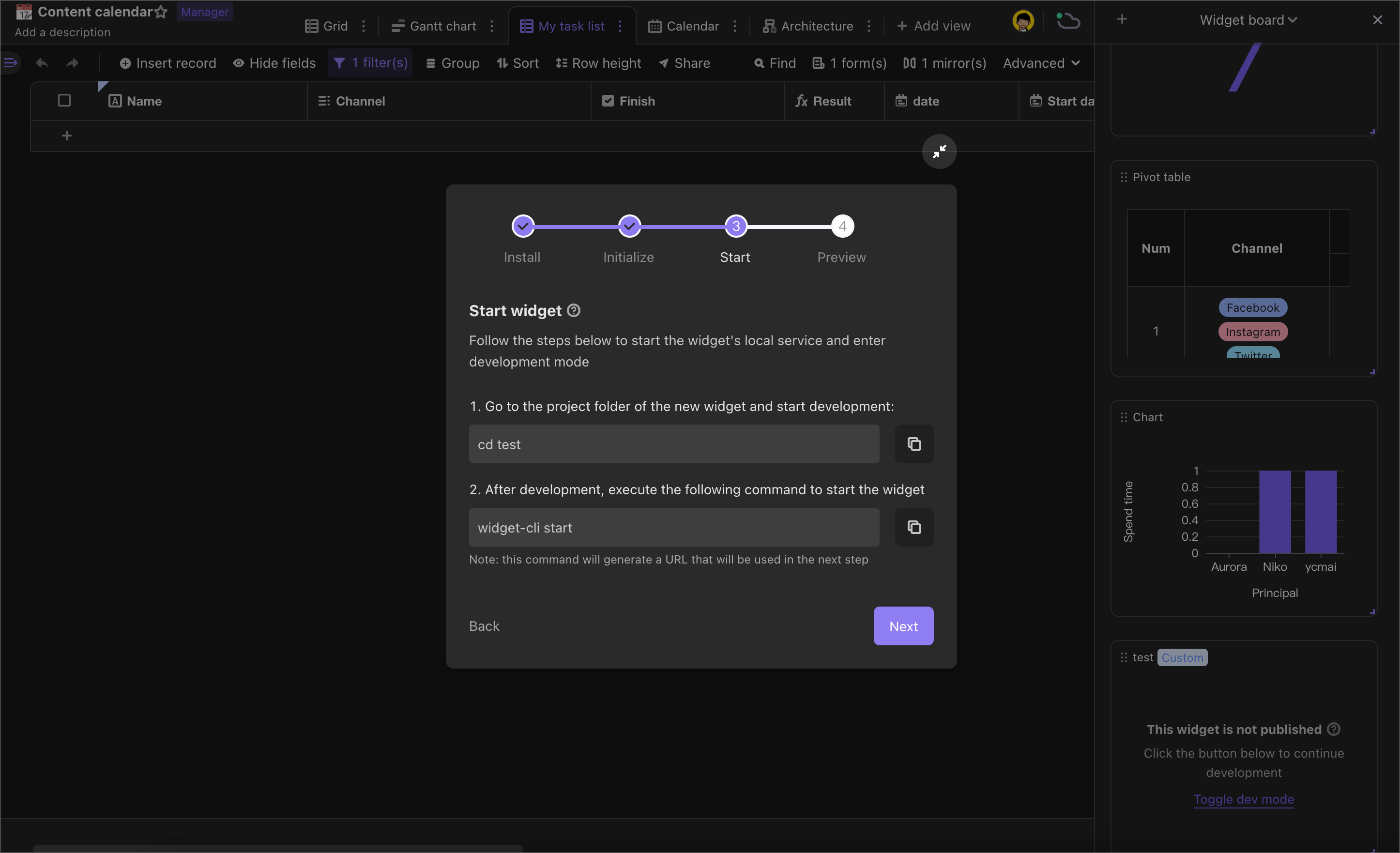
Step 4: Launch Widget
This step is intended to start the local service of the widget into the development mode.
Step 5: Previewing the Widget
To successfully preview a custom widget in the widget panel, you need to lift the browser's security restrictions on loading local code. Follow these steps:
Solution 1: allow-insecure-localhost (for older versions of Chrome)
Copy and paste the following code into the Chrome browser URL bar:
chrome://flags/#allow-insecure-localhostEnable "Allow invalid certificates for resources loaded from localhost" option.
Restart your browser.
Solution 2: temporary-unexpire-flags-m118 (may be removed in future versions)
For newer versions of Chrome where #allow-insecure-localhost flag is not available, follow these steps:
Copy and paste the following code into the Chrome browser URL bar:
chrome://flags/#temporary-unexpire-flags-m118Enable this flag to allow insecure localhost connections.
Restart your browser.
Copy and paste the following code into the Chrome browser URL bar:
chrome://flags/#allow-insecure-localhostEnable "Allow invalid certificates for resources loaded from localhost" option.
Restart your browser.
Note: This method may not work long-term due to potential updates in future versions of Chrome.
Solution 3: Manually access local resources once
Run your small program development environment using
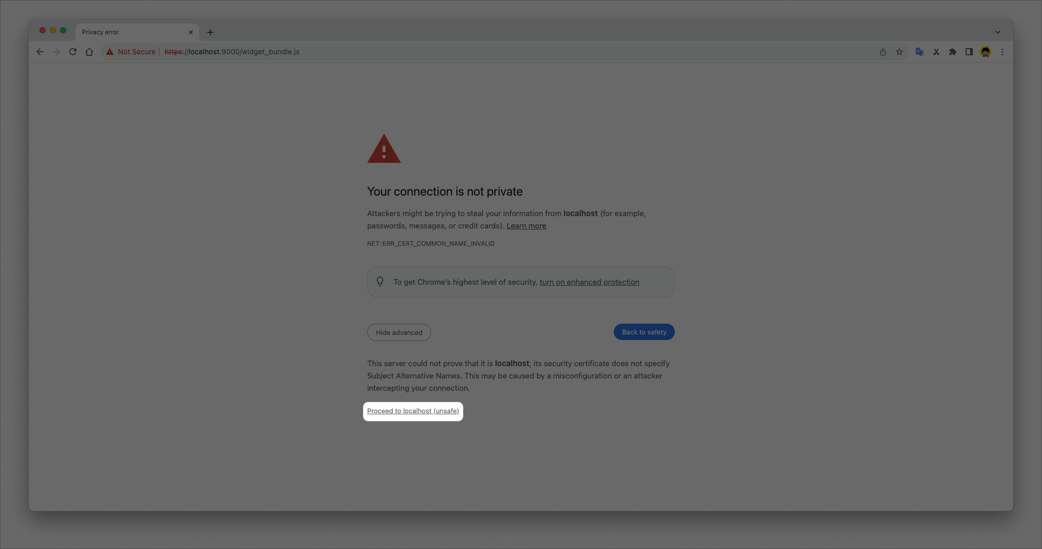
widget-cli startcommand and obtain a local service address likehttps://localhost:9000/widget_bundle.js.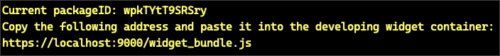
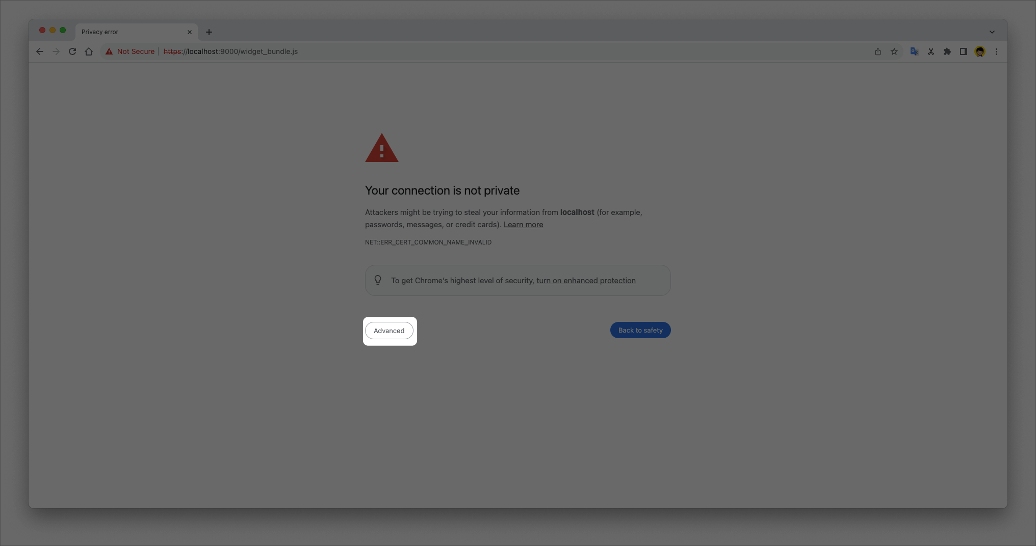
Directly access this address in your browser.
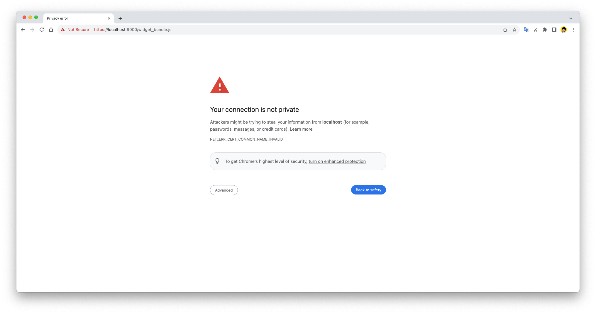
Your browser may block access due to security issues. Click on "Advanced" option and select "Proceed to localhost (unsafe)" to grant access.
After completing these steps, you can proceed with previewing the widget.
Why do you need to do this?
When developing small programs, it is necessary to load resources with local addresses using HTTPS protocol due to browser security specifications. Therefore, lifting the security restrictions on loading local HTTPS code is essential for normal functioning of widgets.
Step 6: Publish Widget
Once your self-built widget is done, you can publish it to the widget center for use by other space members.
We need to do some better work before performing the release action:
Prepare a 64*64 png image as your widget icon, replacing
package_icon.pngin the root directory.Enter the root directory
widget.config.jsonfile modificationnameanddescription, give your widget a name and description.
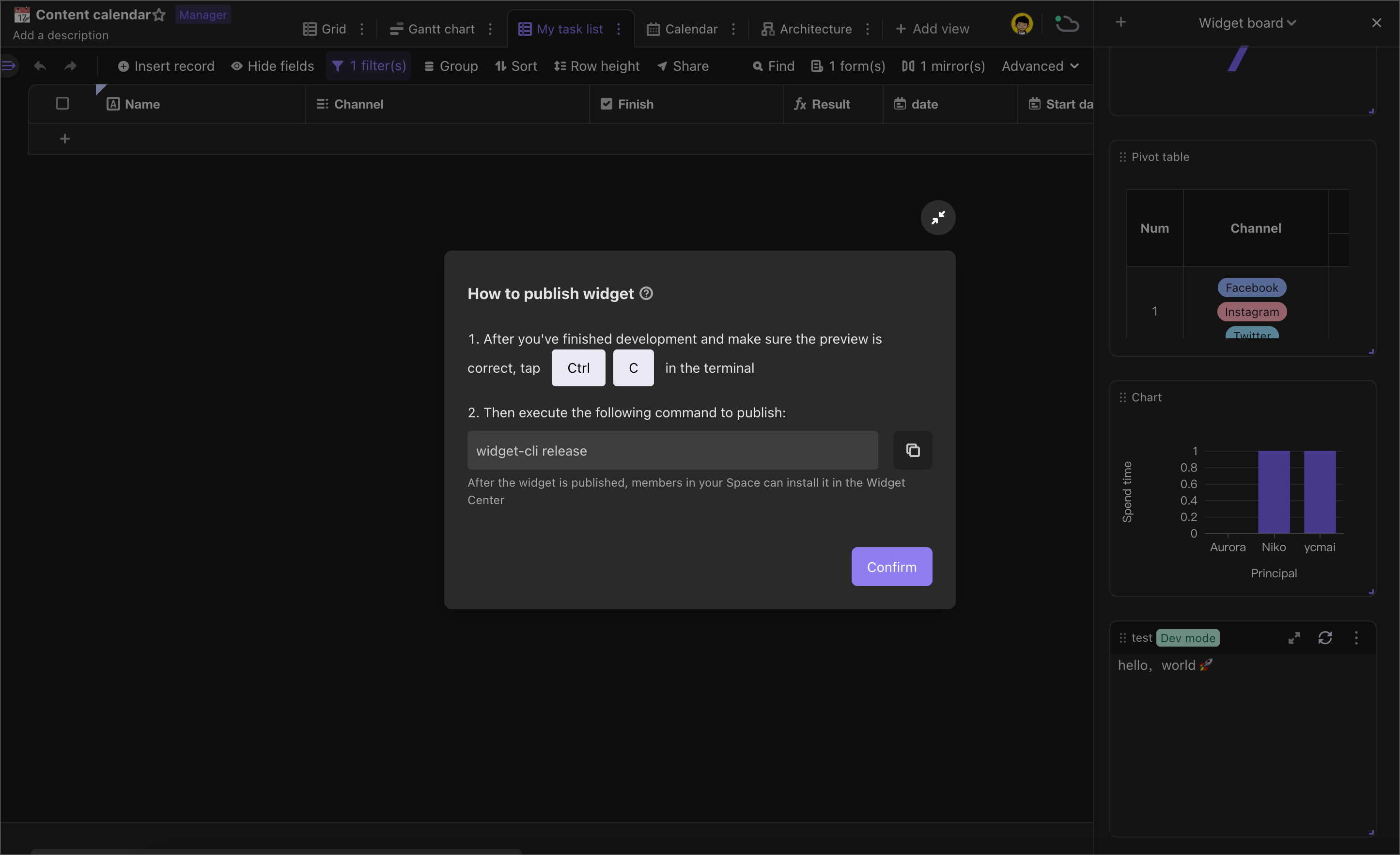
After the development has been completed and previewed correctly, enter the terminal Ctrl + C out of operation, then perform the following command to publish:
widget-cli release

// If you are using the community version or a private version and have not configured an external address for OSS, you need to specify the upload address for the compiled code.
widget-cli release --uploadHost <host>
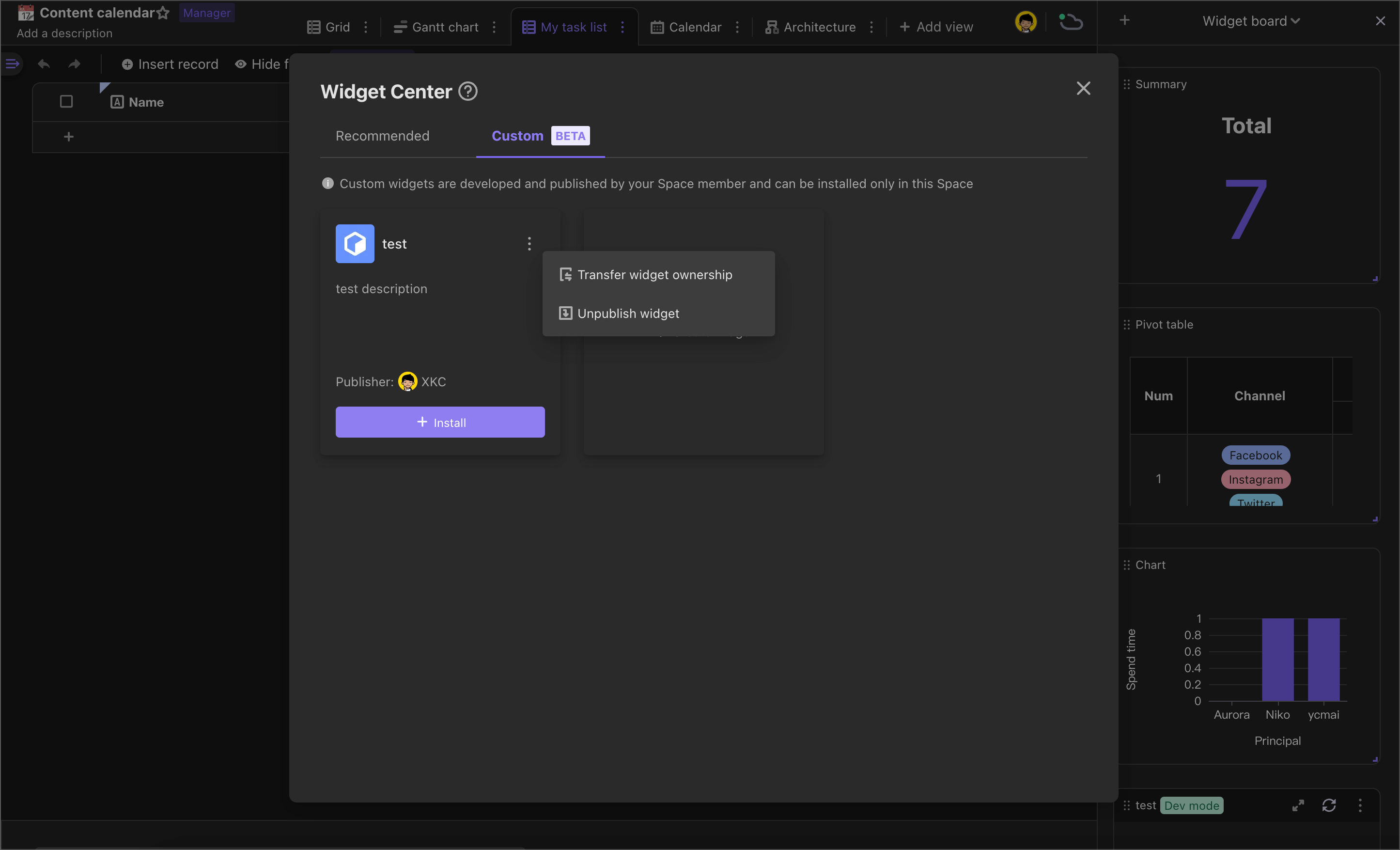
Once published, your widget code will be uploaded to the our server.
At this point, you can click "Exit Development Mode" in the widget menu. You can see the effect of your latest widget and see your newly released widget below the widget center -> Custom.
At the same time, it needs to be noted that self-built widgets can only be published and updated by the account of their creator.If you need to change the publisher of the self-built widget will be able to transfer publication rights to the creator or the administrator of space.
Widget Project File Directory Structure
Open the widget folder, you will see the following directory structure:
my-widget
├── dist/
├── node_modules/
├── src/
│   └── index.ts
├── .gitignore
├── .apitable.yml
├── author_icon.png
├── cover.png
├── package_icon.png
├── package.json
└── widget.config.json
dist/: File addresses where you have built up. You do not need to modify the contents of this folder
node_modules/: standard JavaScript dependency directory, you don't need to modify the content under this folder
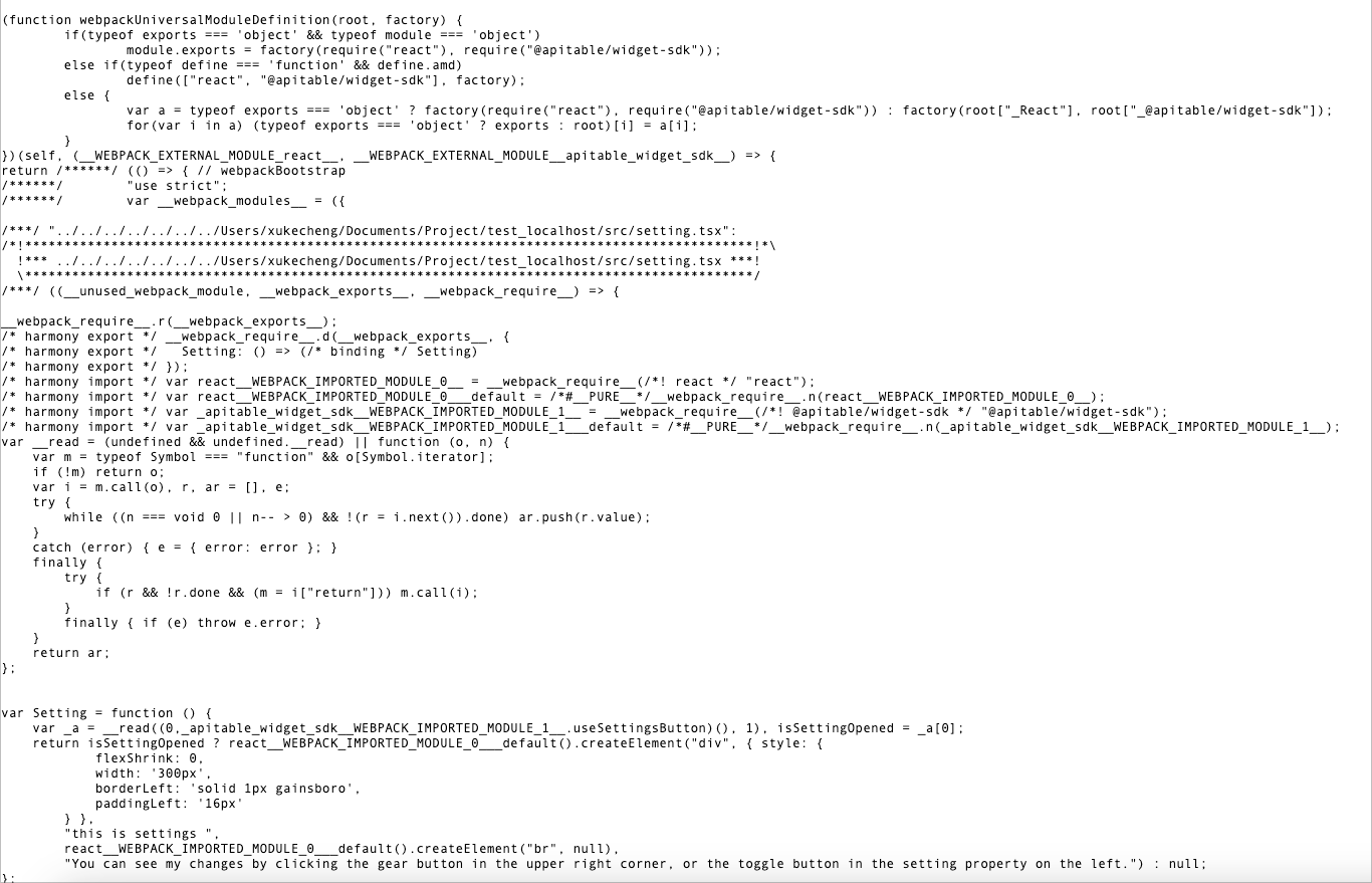
src/: This is your main directory where most development work is done here.
.gitignore: describes which files need to be ignored by git, usually don't need to edit this file
.apitable.yml: private configuration file, which will always store host and token's local caches, widget-cli will automatically maintain the contents inside without manual editing
- host: The host of the AITable API, usually does not need to be modified
- token: User token to see if the current user has posting rights to the widget. Keep and manage it
author_icon.png: user avatar image, 64*64 png file, you can replace it with the avatar you want
cover.png: user avatars,16:9 png file, recommend 464*264 and you can replace it with the image you want
package_icon: widget icon, 64*64 png file that you can replace with the widget icon you want
package.json: standard JavaScript dependency file that you can maintain based on community standards
widget.config.json: widget config file that contains configuration information such as name or description, and you can modify it as needed.The next section is described in detail.
widget.config.json
{
  /** [Automatic Generation] The ID of the widget code package, automatically generates automatically during initialization */
  "packageId": "wpkvaNpJiDstV",
  /** [Automatic Generation] The ID of the global widget code package is automatically generated when it is published to the global situation */
  "globalPackageId": "wpkSybhcxsmGM"
  /** [Automatic Generation] Space ID, a widget must bind a space */
  "spaceId": "spczdmQDfBAn5",
  /** [Automatic Generation] Entrobic code entrance, support JS and TS */
  "entry": "./src/index.ts",
  /** [Modified] Widget name, displayed in the small program installation interface */
  "name": {
    "zh-CN": "开发者模板",
    "en-US": "developerTemplate"
  },
  /** [Modified] The widget icon path, automatically upload when publishing, display in the widget installation interface, please use 64x64 PNG files */
  "icon": "./package_icon.png",
  /** [Modified] The cover map of the widget, automatically upload when publishing, display in the widget installation interface, please use 16: 9 pictures. It is recommended to use 464 x 264 PNG or JPG files */
  "cover": "./cover.png",
  /** [Modified] [Optional] The author's name, displayed in the widget installation interface (the custom widget in the space does not take effect) */
  "authorName": "AITable",
  /** [Modifying] [Optional] The author's icon path, automatically upload when publishing, display in the widget installation interface, please use 64x64 PNG files (the custom widget in the space does not take effect) */
  "authorIcon": "./author_icon.png",
  /** [Modified] [Optional] Author's official website address, click the author's icon to jump (the custom widget in the space does not take effect) */
  "authorLink": "https://aitable.ai",
  /** [Modified] [Optional] The author contact the email (the custom widget in the space does not take effect) */
  "authorEmail": "dev@aitable.ai",
  /** [Modified] The widget description, displayed in the widget installation interface */
  "description": {
    "zh-CN": "developerTemplate 的描述",
    "en-US": "developerTemplate description"
  },
  /** [Optional] The sandbox environment, whether to start the sandbox environment rendering widget */
  "sandbox": true,
  /** [Optional] Operating environment (mobile: mobile terminal, desktop: desktop end), specify the operating environment of the widget, if you do not fill in the default ["mobile", "desktop"]  */
  "runtimeEnv": ["mobile", "desktop"],
  /** [Optional] Installation environment (dashboard: dashboard, Panel: widget panel), specify the installation environment of the widget, if you do not fill in the default ["dashboard", "Panel"] */
  "installEnv": ["dashboard", "panel"]
}